
Pinterest Predicts a Bold, Bright Comeback for Colour in 2025
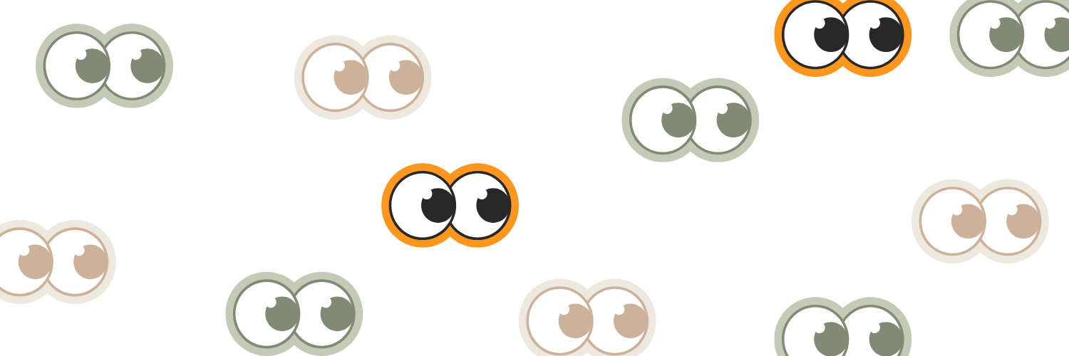
In a cultural moment awash with beige, neutrals and soft minimalism. 2025 is throwing open the paintbox! Pinterest’s trend forecast has declared Primary Play one of the boldest design movements of the year, a return to the unfiltered joy of primary colours, nostalgic design, and the graphic punch of childlike creativity.
It’s not just a visual shift, it’s a rebellion against monotony.
What Is Primary Play?
Primary Play is a celebration of the unapologetically vibrant. It revolves around red, blue, yellow, and their bold geometric companions. This trend draws from the visual language of children’s art supplies, Bauhaus-inspired design, and early 2000s digital playfulness.
Expect to see:
- Blocks of primary colour dominating interiors and fashion
- Quirky shapes and squiggly edges that feel handmade
- Mixed materials that evoke fun and tactility - plastic, foam, felt, wood
- Typographic play with bubble fonts and layered textures
- Childlike creativity driving adult expression in both personal style and décor
This is not about immaturity, it’s about intentional innocence.
The Pinterest Pulse: What the Data Says
Search behaviour on Pinterest is already shifting toward bold simplicity:
- “Primary colour palette” searches are up 80%
- “Modern kids room” has doubled in interest
- “Red and yellow home décor”, “primary colour wedding”, and “playful aesthetic” are all trending
- There’s a surge in content featuring bright, Mondrian-style layouts and pop-art textures
This data indicates that both consumers and creators are leaning toward a more expressive, energetic design language. It’s a dopamine boost for the scroll-weary.
Why Is Primary Play Emerging Now?
A few cultural undercurrents are bringing this trend to the surface:
- Neutral Fatigue: After years of beige on beige minimalism and greige-drenched branding, people are craving colour. Primary Play is the antidote; graphic, energising, and impossible to ignore.
- Nostalgia Reboot: From 90s kids' cartoons to early web aesthetics, this trend echoes memories of Play-Doh, Crayola, and Fisher-Price; safe, joyful, and deeply familiar.
- Mental Wellness through Design: Studies have shown that bright colours can positively affect mood. Primary Play is like colour therapy made aesthetic, especially relevant in a year where optimism feels hard earned.
- Youthful Co-creation: Gen Z and Gen Alpha are blurring the lines between childhood and adulthood in how they design, dress, and decorate. Their influence is loud, fun, and unfiltered.
How Brands and Influencers Can Plug Into Primary Play
This is a trend that transcends category, it can be applied in ways that are both bold and strategic for your social media campaigns:
- Fashion: Expect colour blocked outerwear, retro cartoon graphics, and foam like accessories. Playful doesn’t mean childish, it means confident.
- Home Décor: From primary colour sofas to squiggly vases.
- Branding & Packaging: Chunky fonts, tactile materials and bold contrasts can inject instant shelf impact and nostalgia.
- Events & Experiences: Weddings, pop ups, and brand activations using primary colour themes can tap into joy, emotion, and virality.
And if you’re an Influencer or UGC Creator: lean into lo-fi edits, doodle overlays and saturated tones that feel like a mashup between MS Paint and a museum.
Final Thoughts
Primary Play is a timely reminder that serious design doesn’t have to be serious. It challenges us to reintroduce joy, simplicity and clarity into a chaotic digital world. In 2025, colour isn't just an aesthetic, it’s a declaration.
As Pinterest puts it, this is “colour for grownups” and this time, we don’t have to stay within the lines!
Explore Our Latest Insights
Stay updated with our latest articles and resources.

.jpeg)


Ready to elevate your marketing strategy?
Let’s add some spice to your next campaign 🌶️